For this freelance project, I crafted a masculine and classic label design for Tom's Bourbon. The color palette of navy and gold establishes a classic feel, complemented by subtle texture in the subhead font. Precision matters, and I modified the "T" in "Tom's" for readability. Additional details like the barrel icon and duotone photo enhance visual interest. Managing required text, sizing, and collaborating with a printer for a dieline (as depicted in the photo) underscores my proficiency in client collaboration, typography, and dieline execution.
Skills Used: Working with a Client, Typography, Hierarchy, Layout, Concepting, Dieline
Software Used: Adobe Photoshop
The final product! I took this photo.
Final label with dielines, ready for printing!
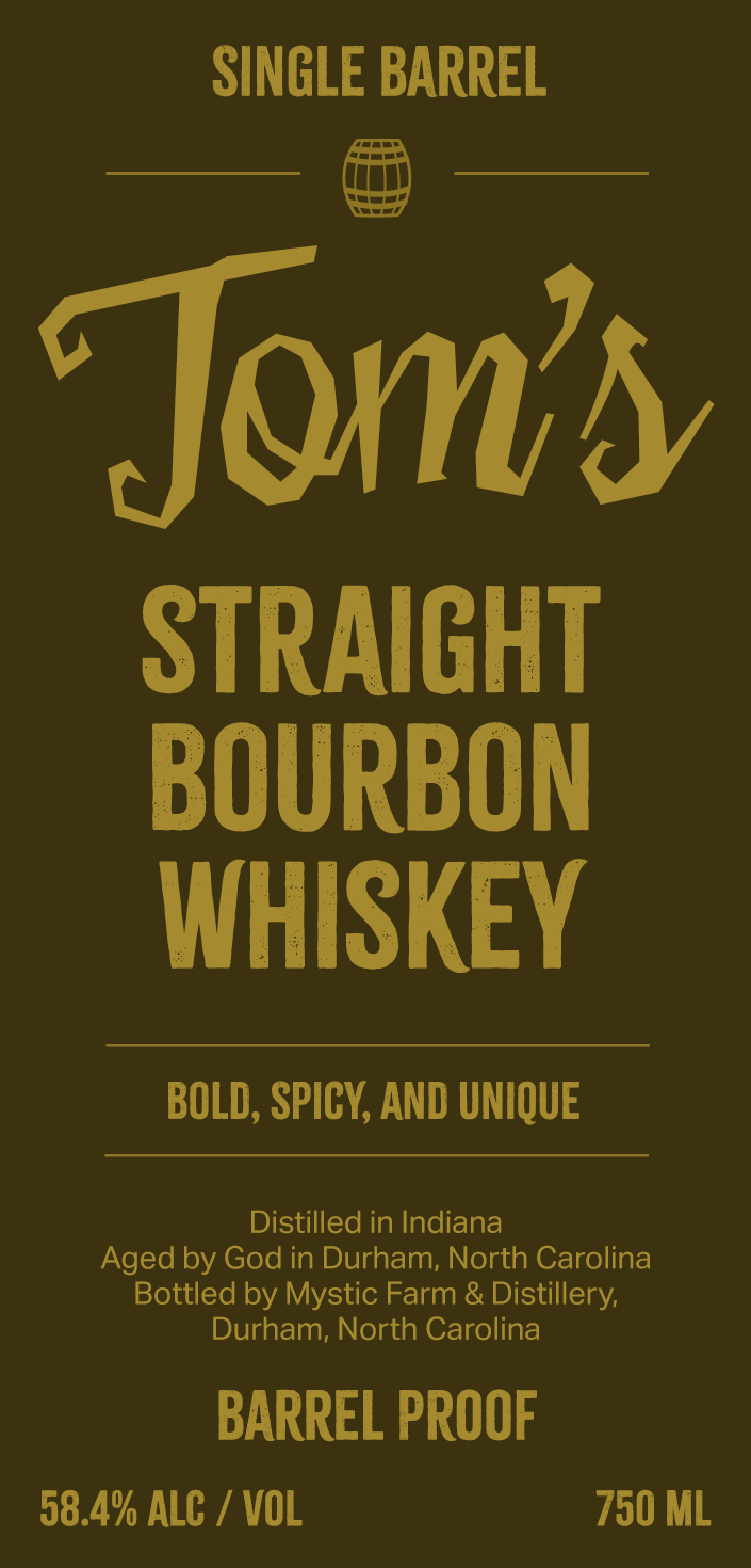
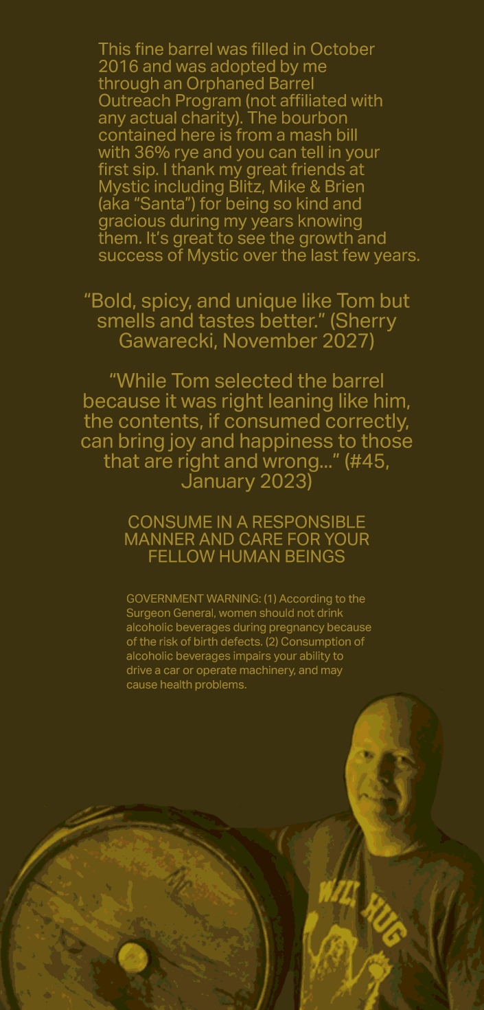
Second version of the label
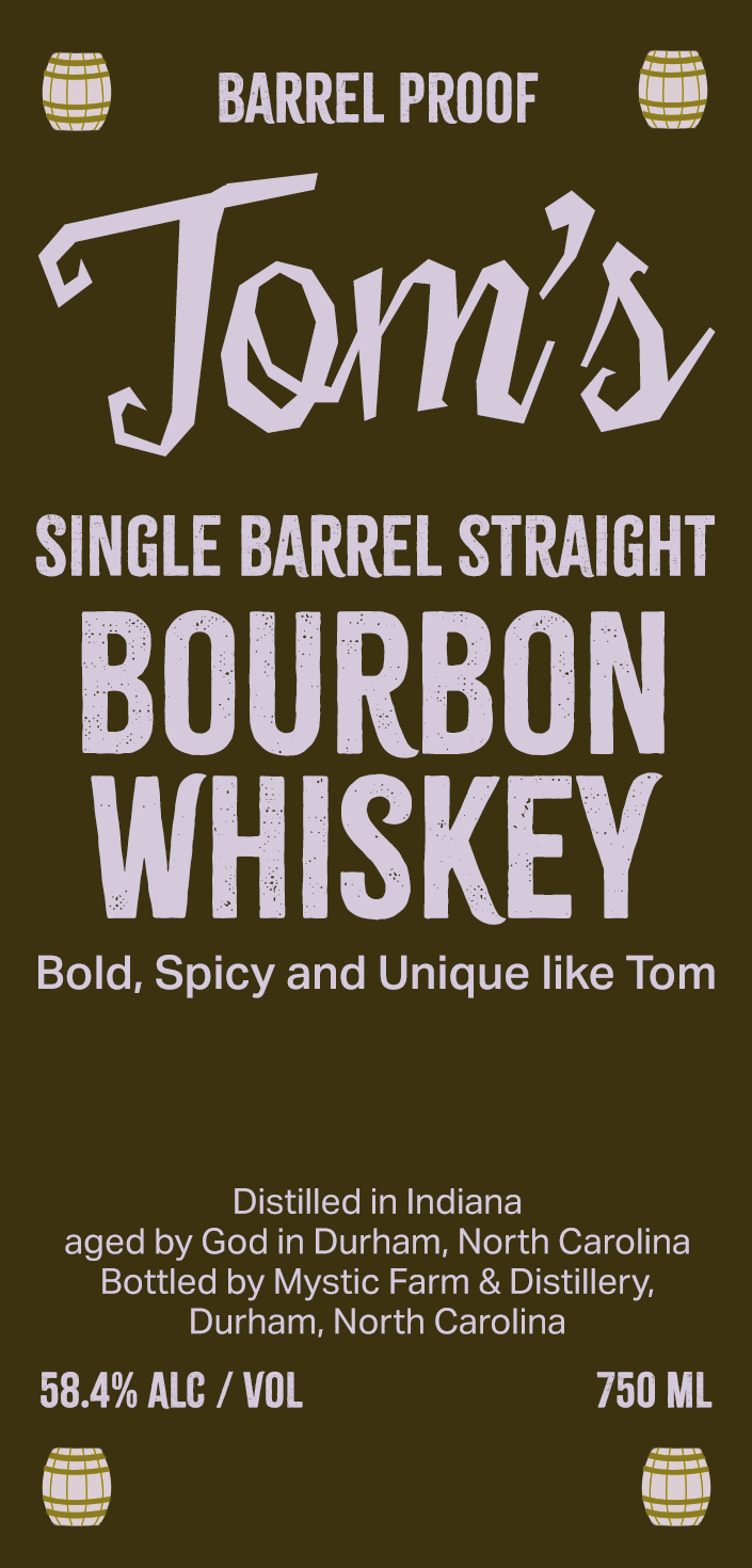
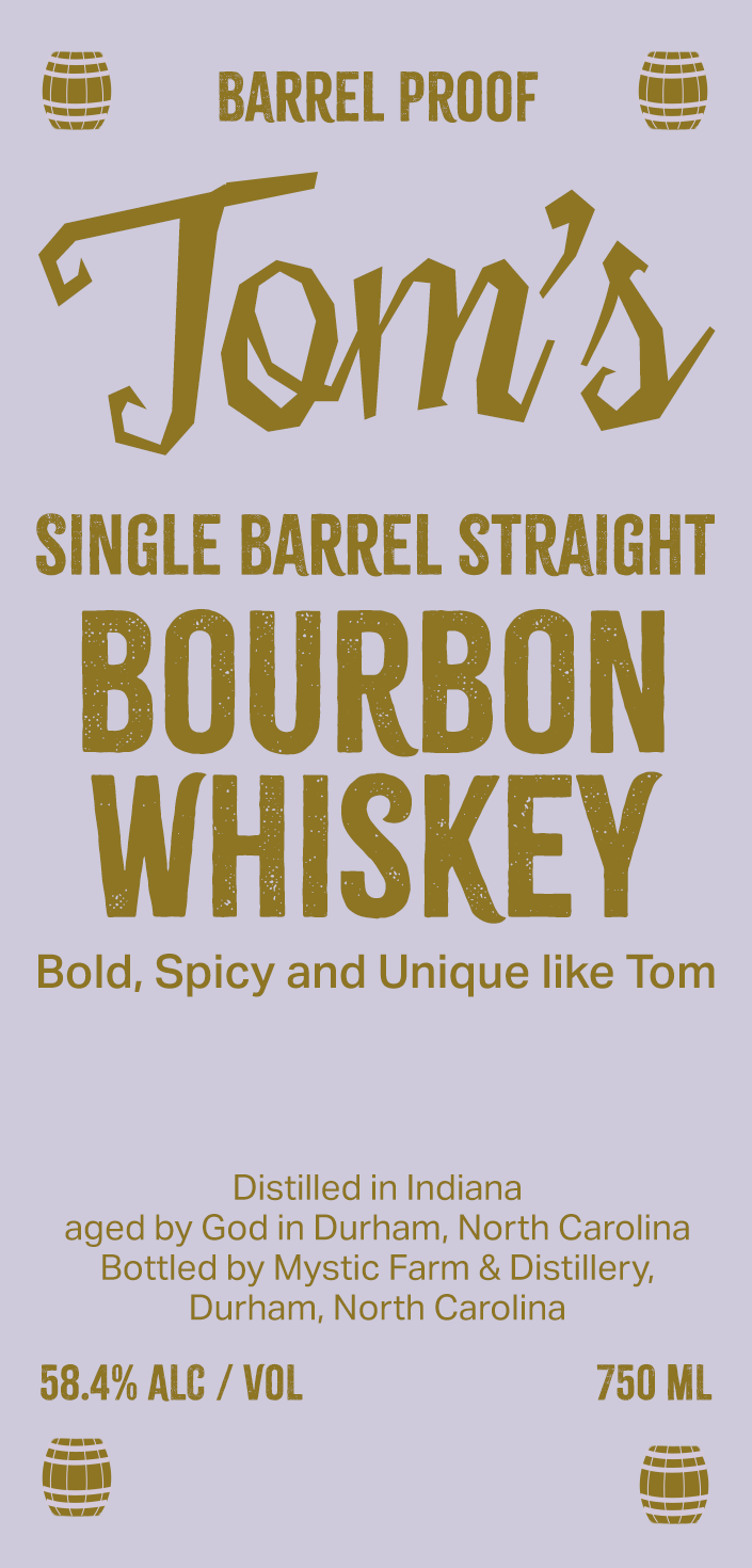
First version of the label
